A week & a half ago I received notification that a Tinzeroes Platial map had received a Platial "
2006 Map Award." First of all, I confess a deep-seeded self-loathing when it comes to my neglected Platial geography projects these days: the viscera of Portland history I've been delving into of late is less map-able than trolleys crossing intersections or buildings that used to be at such-&-such streets. Secondly, at least initially, if I were to pick one of my 4 platial maps as a "favorite," I would probably pick
Demolished Buildings of PDX over actual 2006 "Best Local History Map" winner
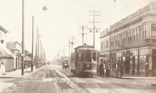
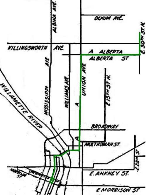
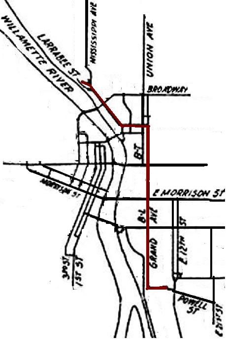
Historical Portland Trolley Lines.
But then I took a gander at the trolley map, & although it is rather skimpy in terms of factual information, & although its largely a mapping of research & photos compiled by other people, I suppose it is, truthfully, a fairly interesting juxapositioning of historical data using a rather unique infobahn tool. To borrow from a friend's synopsis, the Trolley Map presents handy historical "capsules" for injestion: small in content but easily digestible.
I guess now is as good of a time as any to mention that some of the glitter of Portland's trolley heyday has tarnished a bit for me. At its apex, Portland's (privately owned) trolley network was deeply rooted in conflicts of interest scandalous by today's standards: city contracts handed to individuals who held significant ownership stakes in the trolley network, who in turn used same city-contracted tracks to move materials for other city public works projects - think if Tri-Met were a private corporation, & then one of its major shareholders received the contract to build the tram, & then used Tri-Met rails to move tram materials to the construction site at no cost to himself.
With the ol' Trolley map, I was certainly smitten w/ the rather romanticized concept of these wonders of public transportation inadvertently laying a foundation for Portland's current uniqueness. The initial conclusion I drew from this observation was that urban planning was as much dumb luck as anything else, if not exclusively the same. I suppose that conclusion is unchanged, but iced w/ a considerably larger serving of pessimism: monied interests lining thier pockets w/ tax-payer dollars, over & over, throughout history.
But hey, enough of this tragedy of history stuff, right? Lets looky at some real maps! Like this electoral ward map of Portland, circa 1905.

Things of interesting note: the map shows the then city limits. Although there are 10 wards, it really sticks out at me that 6 of them are on the remarkably smaller-in-area west side, which underlines the way in which the city's demographics were drastically different in terms of population density 100 years ago: most people lived "downtown," and the eastside, while growing, was less dense & less populous.
Next map.
This 1 shows the ethnic layout of Portland circa 1913. If you had any doubts as to Portland's white-ness, I suppose this can lay those doubts to rest. Modern-day anxiety over Portland's snowy reputation aside, its always somewhat bizarre to think that a century ago the presence of Swedish, Norwegian, & German immigrants were considered noteworthy. Chinatown is clearly defined, although the area apparently immediately south of Ladd's Addition once being predominately black, or the German- & Russian-Jewish enclaves in the Lair Hill vicinity caught me off guard. The Italian presence in & around the Brooklyn Yards I had heard about.

Next up is a map of "high-rent" & "working-class" neighborhoods in Portland. Anyone who has spent a significant amount of time touring Portland & taking the time to note the size & style of the older homes should not be surprised by the layout presented by this map. Still, Goose Hollow: working class? That does not jive w/ my perceptions.

All 3 maps are from MacColl's
Shaping of a City.
1-d.d.
1 MacColl, E. Kimbark. The Shaping of a City: Business and Politics in Portland Oregon 1885 to 1915. The Georgian Press Company, Portland, Oregon. 1976. p. 346, 460, 463.